What a Sales Performance Dashboard Actually Tracks
What a Sales Performance Dashboard Actually Tracks

A training performance dashboard turns AI role-play sessions into objective readiness scores, coachable moments, and clear manager actions. Instead of guessing who is ready for a tough renewal call, you get a scored record: competency breakdowns, practice volume, and searchable transcripts. That’s the core job of a performance dashboard sales teams can actually use, as opposed to a spreadsheet nobody trusts.
Continuous practice with real-time feedback can lift performance by up to 88 percent versus static training, which is why more sales leaders are prioritizing readiness metrics over generic completion rates. A platform like XL Roleplay produces exactly this kind of output:
- Scored coaching reports tied to your organization’s own sales methodology
- Readiness scores that move as reps repeat and refine specific skills
- Full transcripts managers can search for coachable moments
Key Takeaways
A performance dashboard sales teams can trust turns AI role-play sessions into scored, searchable coaching evidence rather than a vague completion checklist.
| Point | Details |
|---|---|
| Readiness is a trend, not a snapshot | Track score movement across repeated scenarios, not a single practice result. |
| Rubric breakdowns drive coaching | Discovery, objection handling, and talk-to-listen ratio each need their own line, not one blended score. |
| Formal coaching moves win rates | Companies with structured coaching programs report a 16.7 percent higher win rate. |
| Pilots need multiple signals | Pair ramp time and rubric gains with pipeline signals to avoid lazy attribution. |
| XL Roleplay supplies the data layer | Scored coaching reports, transcripts, and readiness scoring come built into every role-play session, ready for a 30 to 45 day pilot. |
Table of Contents
- Essential Metrics Every Sales Team Performance Dashboard Should Show
- How Do You Use a Sales Dashboard to Run Better Coaching?
- What KPIs Should a 30 to 45 Day Pilot Track?
- Integration and Data Flow: Making the Numbers Portable
- How XL Roleplay Puts These Principles Into Practice
- Best Practices for Dashboard Design and Visualization
- Real-World Examples of Sales Coaching Dashboards in Action
- Keeping Dashboard Metrics Relevant Over Time
- Customizing Dashboards for Different Sales Roles
- Common Pitfalls When Interpreting Dashboard Data
- The Real Value of a Sales Dashboard Isn’t the Score
- Turn These Metrics Into a Working Pilot With XL Roleplay
- Sources
Essential Metrics Every Sales Team Performance Dashboard Should Show
A dashboard that just displays a single “score” is barely more useful than a gut check. The value comes from layering several sales performance metrics so a manager can see not just how a rep is doing, but why.
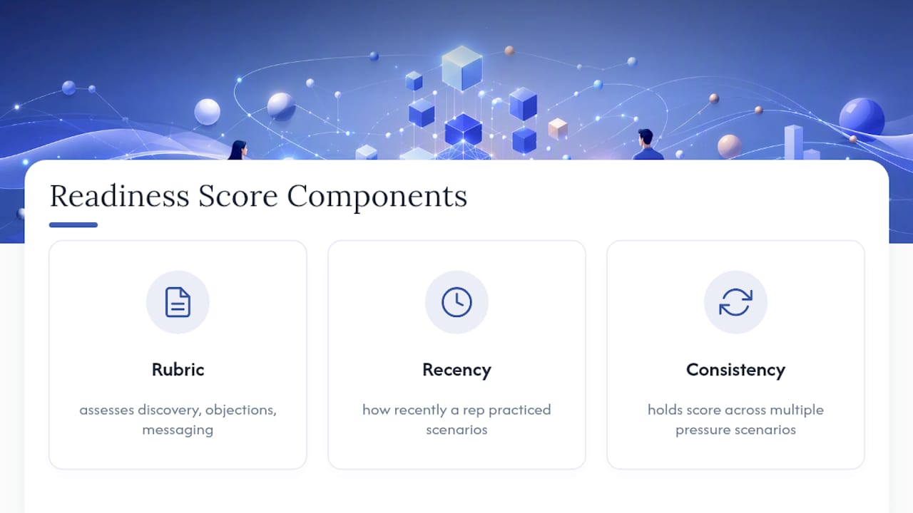
Readiness or composite scoring should sit at the top. This number typically blends rubric performance, recency of practice, and consistency across scenario types. A rep who scores well once on an easy objection isn’t “ready.” A rep who holds a score across five different pressure scenarios is. Track the trend line, not the snapshot.
Competency and rubric breakdowns matter more than the composite number itself. Discovery quality, objection handling, talk-to-listen ratio, and messaging adherence should each get their own line. A rep can have a solid overall score while still fumbling discovery questions, and that gap is invisible until you break the rubric apart.
Practice volume and engagement round out the picture: sessions completed per rep, completion rates against assigned scenarios, and time spent in active practice versus passive review. Top performers tend to log more reps in role-play scenarios and show faster score improvement over time, which is one reason practice volume belongs on the dashboard alongside skill scores, not as an afterthought metric buried in an admin report.
Pro Tip: Sort your team view by “practice volume, low score” first. That’s your highest-leverage coaching group. Reps with low volume and low scores usually just need encouragement to log in, not a skills intervention.
Round out the dashboard with transcript search and highlighted coachable moments, trend views across weeks or months, and cohort comparisons that show whether new hires are closing the readiness gap against tenured reps on the expected timeline.
How Do You Use a Sales Dashboard to Run Better Coaching?
A dashboard only pays off if it changes what a manager does on Tuesday morning. Here’s a workable cadence for putting sales performance metrics into daily use:
- Daily (5 minutes): Scan for reps with a readiness score drop of more than one band, or anyone who missed an assigned practice session. This is triage, not deep analysis.
- Weekly (20 to 30 minutes): Review rubric trends by competency across the team. If objection handling is lagging across five reps, that’s a coaching topic for the whole team, not five individual conversations.
- Monthly: Pull cohort comparisons. Are new hires tracking toward readiness on schedule? Is a specific scenario type consistently scoring low across the roster?
Use transcripts and rubric data to run tight, 10 to 15 minute micro-coaching sessions instead of open-ended call reviews. Pull the transcript segment where the score dropped, play it back, and ask the rep what they’d change. That focused format respects everyone’s time and keeps coaching specific instead of generic.
The payoff for this discipline is well documented: companies with formal coaching programs report a 16.7 percent higher win rate than those without. A dashboard doesn’t replace coaching. It tells you exactly where to point it.
What KPIs Should a 30 to 45 Day Pilot Track?
A pilot without clear success criteria just produces opinions. Set these KPIs before day one, not after you’ve seen the first month of data.
- Time-to-first-opportunity and overall ramp time for new hires in the pilot cohort
- Practice volume per week, tracked against a target (not just “more is better”)
- Rubric score gains by competency, measured at baseline and at 30 to 45 days
- Manager hours saved on informal coaching and call shadowing
- Early pipeline signals, like stage progression or response rates, viewed as directional, not proof
| KPI | How to Measure It |
|---|---|
| Ramp time | Days from hire to first qualified opportunity, trained vs. untrained cohort |
| Practice volume | Sessions per rep per week against an assigned target |
| Rubric gains | Score change by competency, baseline vs. end of pilot |
| Manager hours saved | Self-reported hours spent on informal coaching, before vs. during pilot |
Run a trained cohort against an untrained one where possible, and always pair before/after scores with a second signal, since a single headline metric invites lazy attribution. The Insivia guide on tying AI training to revenue outcomes makes the same point: match your metrics to what the program actually trains, so a prospecting-focused pilot gets judged on response rates, not close rates.
Aim for at least eight to ten reps per cohort to see a usable signal, and report results in ranges, not single numbers. When you present to executives, lead with the KPI that ties most directly to revenue risk, whether that’s ramp time for a hiring-heavy quarter or win rate for a team facing tougher renewal conversations.
Integration and Data Flow: Making the Numbers Portable
A dashboard that lives in isolation from your CRM and learning systems loses most of its value within a quarter. Two integration choices determine whether your data stays useful.
xAPI and a learning record store (LRS) let you collect and analyze practice activity across individuals and cohorts over time, rather than trapping it inside one tool’s reporting screen. This is what makes historical readiness tracking possible when reps move teams or when you want a two-year view of a role’s skill trajectory.
CRM mapping matters just as much. Map rubric competencies and readiness bands to CRM fields like opportunity stage or deal risk, so a manager reviewing a stalled deal can also see whether the rep’s objection-handling score has been trending down.
On transcripts: decide upfront what gets retained, what gets redacted, and who has access. Full transcripts are the most valuable coaching asset on the dashboard, but they also carry the most sensitive language from live practice sessions.
- Store transcripts with role-based access, not open team visibility by default
- Redact or restrict any scenario content tied to real customer names or account details
- Correlate readiness trends with early pipeline signals as a directional read, not proof of causation
How XL Roleplay Puts These Principles Into Practice
Most of what makes a training dashboard useful only shows up once you look at real session data: full transcripts, scored rubrics, and readiness numbers that move with practice, not with time served.
XL Roleplay builds its coaching reports around exactly that structure. Reps get scored against the organization’s own methodology after each live voice or video session with an AI buyer, and managers get the transcript and rubric breakdown behind every score, not just a final number.
A manager reviewing a new hire’s third week typically pulls up two things: the readiness trend line and the transcript from the session with the lowest objection-handling score. Fifteen minutes later, that rep has a specific, evidence-based coaching note instead of a vague “keep practicing” comment.
That’s the operational shift a good dashboard forces: from impressions to evidence, and from generic feedback to a coaching conversation anchored in an actual transcript.
Best Practices for Dashboard Design and Visualization
A dashboard crowded with fifteen metrics on one screen defeats its own purpose. Managers stop looking at it within a month. Design for the decision, not for completeness.
Put readiness score and practice volume front and center, since those two numbers answer “who needs my attention today” faster than anything else. Push granular rubric breakdowns one click deeper, where a manager goes only when they need to diagnose a specific gap.
Use color with restraint and consistency. A red/yellow/green readiness band works only if the thresholds stay fixed across weeks. If “yellow” means something different every time leadership changes the target, the color loses all meaning and reps start ignoring it.
Trend lines beat single numbers almost every time. A readiness score of 72 tells you where a rep stands. A line showing that score climbing from 58 to 72 over three weeks tells you the coaching is working. Static numbers invite snap judgments; trends invite context.
Keep cohort comparisons visually separate from individual performance views. Mixing “how does Jamie compare to the team average” with “how is the whole new-hire class tracking against ramp targets” on the same chart usually confuses both questions instead of answering either one clearly.
Finally, build the dashboard around the coaching cadence you actually run, not the other way around. If your team reviews scores weekly, the default view should default to a weekly window, not an all-time average that hides recent movement.
Real-World Examples of Sales Coaching Dashboards in Action
The clearest illustration of a working dashboard is a mid-size SaaS sales team using role-play practice to compress ramp time for new hires. Organizations introducing structured AI role play have reported cutting time-to-ramp by roughly half in some cases, largely because managers could see exactly which competency was holding a rep back instead of relying on a generalized 90-day checklist.
A customer-service leader running renewal-risk training offers a different pattern. Instead of tracking generic call scores, the dashboard weighted objection handling and de-escalation rubric items more heavily, since those were the specific skills tied to churn conversations. The visualization didn’t change structurally, but the weighting inside the rubric did, which is a customization point many teams overlook.
Enterprise sales organizations deploying AI role play at scale report that the combination of complete transcripts, competency-based scoring, and trend analysis is what actually drives measurable skill gains, not the practice sessions alone. The dashboard is the layer that turns individual practice reps into a management tool.
The common thread across these cases isn’t the software. It’s that managers reviewed the data on a fixed cadence and acted on specific rubric gaps instead of glancing at an overall score once a quarter and moving on.
Keeping Dashboard Metrics Relevant Over Time
Metrics rot. A rubric built around last year’s sales methodology will quietly stop measuring what your team actually needs within two or three quarters, especially after a messaging change or a new competitor enters the picture.
Revisit rubric weighting every time your sales methodology changes, not on a fixed annual schedule. If your team shifts from a feature-pitch approach to a consultative discovery model, the old rubric will keep scoring reps against skills that no longer match how you sell.
Audit which metrics managers actually open. Dashboard platforms tend to accumulate metrics nobody uses, since a healthy sales dashboard tool gets pruned, not just expanded. If a competency score hasn’t influenced a coaching decision in a quarter, question whether it’s still the right lens.
Refresh cohort baselines periodically as your hiring mix changes. A readiness threshold calibrated for experienced hires will misjudge a wave of new grads, and vice versa. Treat the “good enough” readiness bar as a moving target tied to who you’re actually hiring, not a fixed number set once and forgotten.
Build a light quarterly review into your process: ten minutes checking whether the metrics still map to current sales priorities, whether the rubric still reflects your methodology, and whether any competency has quietly become irrelevant.
Customizing Dashboards for Different Sales Roles
A single dashboard template rarely fits both a full-cycle enterprise rep and a high-volume SDR team. The metrics that matter diverge fast once you look past the top-line readiness score.

For SDRs and prospecting roles, weight practice volume and objection-handling reps more heavily than deal-strategy competencies. Response quality on cold outreach objections matters more here than discovery depth, since discovery typically happens later in the cycle with a different rep.
For account executives and full-cycle reps, discovery quality, negotiation, and messaging adherence deserve the heavier rubric weighting. Practice volume still matters, but the competency mix should mirror the actual skills a closing conversation demands.
For customer-service and renewal teams, de-escalation and objection handling around cancellation risk carry more weight than pure sales technique. The scenario library itself should reflect renewal-specific pressure points, not generic cold-call objections.
For sales managers themselves, the dashboard view should shift from individual rubric scores to team-level trend and cohort data, since their job is spotting patterns across five or ten reps, not reviewing their own transcript.
Customization doesn’t mean building five separate tools. It means adjusting which rubric items get weighted, which cohort comparisons surface by default, and which scenario library each role practices against.
Common Pitfalls When Interpreting Dashboard Data
The most common mistake is treating a single dashboard number as proof of causation. A readiness score climbing alongside a good sales quarter doesn’t mean the practice caused the quarter. Multiple signals, like the multi-signal comparison approach Insivia recommends, guard against that trap far better than one headline metric.
A second pitfall: comparing reps across very different scenario difficulty without adjusting for it. A rep who only practices easy objections will out-score a rep tackling harder pressure scenarios, even if the second rep is genuinely stronger. Normalize for scenario difficulty before ranking reps against each other.
A third: mistaking low practice volume for low skill. Sometimes a rep with three sessions and a high score is simply more experienced and doesn’t need the reps. Sometimes it means they’re avoiding practice. The dashboard alone won’t tell you which, so pair a volume dip with a quick conversation before assuming either.
A fourth pitfall shows up at the team level: averaging scores across a group that includes both brand-new hires and tenured reps produces a number that describes nobody accurately. Segment cohorts by tenure before drawing conclusions about team-wide readiness, or the average will mask both your best and worst performers.
The Real Value of a Sales Dashboard Isn’t the Score
The industry oversells the readiness score itself and undersells the transcript sitting underneath it. A number tells you that something changed. Only the transcript tells you what to coach.
Most conventional advice on this topic treats dashboards as a reporting layer, something you check to justify a training budget to a CFO. That’s backwards. The dashboard’s real job is triage: telling a manager which fifteen minutes of coaching today will matter most, out of the twenty they actually have.
Where I’d push back hardest on common practice: teams chase a single “readiness” number as if it were a grade, when it should function more like a compass. A score that isn’t moving despite steady practice volume is more informative than a high score reached once and never repeated.
Prioritize practice volume and rubric trend lines over any single composite score, and build your coaching cadence around what the transcripts reveal, not around a leaderboard. The teams getting the most out of these platforms are the ones treating the dashboard as a coaching tool first and a reporting tool second.
Turn These Metrics Into a Working Pilot With XL Roleplay
Everything covered here, readiness scoring, rubric breakdowns, searchable transcripts, and coaching cadence, is what XL Roleplay’s dashboard produces by design, not as an add-on report bolted onto a generic LMS.
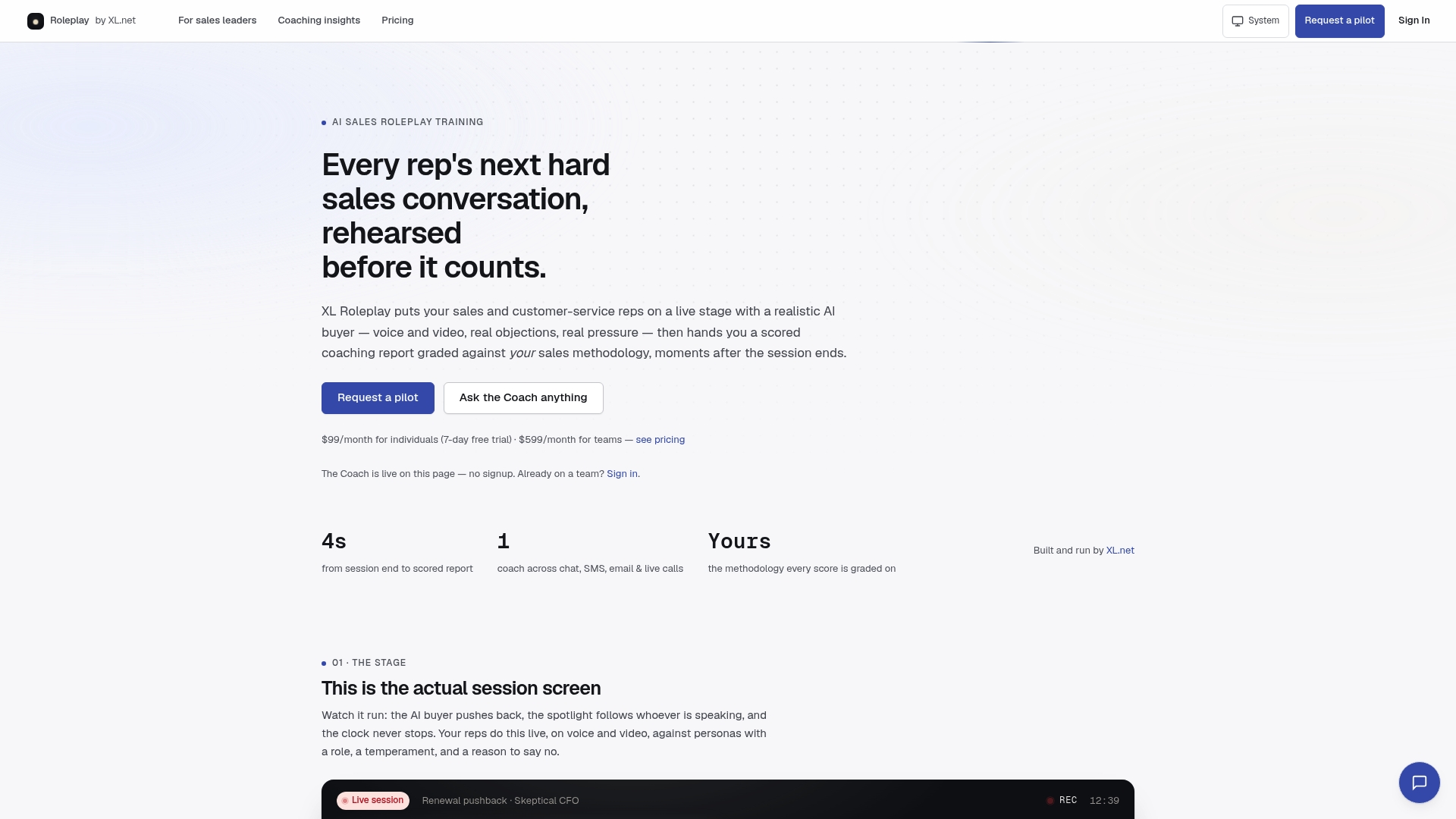
Reps practice live voice and video role-play against AI buyers built from your own objection library, and every session comes back scored against your specific sales methodology, with a full transcript attached. That’s the difference for a sales leader piecing together a performance dashboard sales teams will actually check daily: you’re not exporting call recordings and hoping a manager finds time to review them. The scoring and transcript search are already built in.
A 30 to 45 day pilot is straightforward to structure: a trial cohort, a scenario set matched to your actual sales calls, and the KPIs outlined above, ramp time, practice volume, and rubric gains, tracked from day one. Visit the for sales leaders page to see pilot options and get a trial started for your team this quarter.
Sources
- Why AI-powered role play belongs in sales enablement
- How to tie AI sales training to revenue performance - Insivia